I was playing around with different types of data at work when I found an interesting article on the application of time-series forecasting to predict the future performance of sports players. Of course, I jumped at the opportunity to have fun with another data science tool and apply it to Brazilian Jiu Jitsu.
What is Time-Series Forecasting?
Time-series data is the collection of date and time intervals, usually in a sequential order. Time-series analysis explores how something changes over a period of time and extracts meaningful insights. Time-series forecasting takes historical data, like trends by the day, month, and year, and uses a machine learning model to predict future data points based on past performances. It takes into account seasonality patterns that occur at similar intervals.
In the Jiu Jitsu world, there are clothing purchases right after someone gets promoted to a new belt or a spike in instructional video sales right after a fighter wins a big tournament. Both of these things exhibit a seasonal element that can be tracked and possibly predicted.
Time-Series Forecasting for Jiu Jitsu
In a traditional time-series
forecast, you need two columns of data: first, a date-time stamp column at which
something occurs (for example, gi purchases by month throughout
the year); and second, a numeric column that you want to predict (the
price of gis purchased).
In the time-series explored below, I decided to stick to the data I already had, which is the BJJ Heroes dataset that we collected at the end of 2019. More about the dataset with pretty charts can be found here. In short, it contains 1,075 total fighters and 396 black belt male fighters that have extensive grappling records and fight histories. We draw from the smaller subset of fighters and I'll focus on how the match concluded (points, submission, referee's decision, etc.), the tournament (which reflects a monthly seasonality - the World Championship occurs every May), the year, and the match round (quarters vs semi-finals, which I engineer into a third level of time interval down from month, but more on this later).
In past projects, I focused on the predictive capacity of our data for a win or loss outcome. Now I'll be looking to predict the final score of a match. Submissions and decisions will be represented with a numeric value. In the article that inspired me, the author sought to predict how many points a basketball player would score per game. This is a similar exercise.
Prediction: Match Finishes by Points & Submissions
I wanted to see if I could use a model to predict points, since it is a numeric value. However, many matches were finished with a submission or a referee's decision. In that case, I engineered the dataset by assigning a numeric value to the finish. I knew already that a high percent of matches ended with a score under 10 points, with a handful under 20 points. It was highly uncommon to score between 20-30 points, so I assigned the submissions a numeric value in this range. Here is the number assignments for non-score finishes:
- Points (maintain their numeric value)
- Penalty - 0.2
- Advantage - 0.5
- Referee's Decision - 1
- Injury / DQ - -1
- Uncommon submissions - 19
- Triangle - 21
- Legs/feet - 23 (ankle locks, heel hooks, tow holds, knee bar, etc)
- Arms/shoulders - 25 (kimura, americana, baratoplata, tarikoplata, etc)
- Arm bar - 27
- Choke from the back - 29 (bow and arrow, rear naked choke, etc)
- Other chokes - 31 (guillotines, head and arm, cross choke from mount, etc)

Forecast: The Date-Time Value
Admittedly, our dataset was not perfect for a time-series forecast, and thus its predictive power must be taken in light of the constraints of the data itself. However, it is another opportunity to push our industry to up its game in the data collection aspect of recording events, so that we may learn about our sport. However, I was able to engineer the dataset to create a quasi date/time value for the forecast.
Luckily, the dataset had the year and the competition name as a start. I was able to use the competition name to enter the month of the tournament in my date-time value.
Unfortunately, there were 1,147 unique tournaments in the dataset and I didn't feel like manually looking up the precise dates of all 1,147 events. Nonetheless, I took the top 38 most frequent and seasonal events, such as the World Championships, European Championships, Brazilian Nationals, Asian Open, ADCC, No Gi World Championships, plus a handful more. This was enough to map the events across all 12 months of the year and account for about 56% of the dataset of 24,852 matches recorded.
The events I neglected to match were international opens and specialty events. I used a mathematical method, called interpolation, to fill the missing values, thus spreading out the events by month throughout the year.
Next, since the dataset didn't have a time interval besides year and month, I used the stage to create a new time interval that represented the day of the month. The dataset recorded the stage of the match, such as the elimination rounds, quarter finals, semi-finals, and finals. The stage was mapped into a day interval and spread out over the month. This was done to track patterns in match finishes from the opening round of a tournament to the stress and pressure of final matches.
I put it all together and plotted how matches were finished over the course of the last 10 years pre-pandemic. Here is what that chart looks like.


What Does the Forecast Look Like?
Our dataset went through to the end of 2019. I set the forecast forward by three years to the end of 2022. Here is what it looks like:

Comparing Finishes by Fighter
What would it look like if we could forecast a match finish by individual fighter? I took the top 5 fighters with the most matches in the dataset and ran individual forecasts on each of them. For example, Leandro Lo had fought the most matches as recorded in the dataset. Here is his individual forecast.
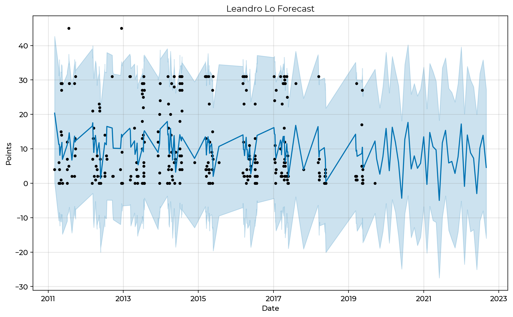
The dark blue line extended into 2022 represents the model's forecast of his performance. Interestingly enough, the model has predicted a score of -1 (for injury of DQ) for him in May at the World Championships during the next three cycles. This was heavily influenced by his injury in the finals of the 2018 World Championships against Mahamed Aly and bow out by Marcus Buchecha in the Open Class finals. Another pattern evident in the chart shows that he more often finished matches by points than submission. The point range in steadily under 20 in the forecast, at least towards the latter half of the decade.
Now we compare a forecast for Leandro Lo, Jaime Canuto, Joao Miyao, Gianni Grippo, and Adam Wardzinski.

Wow there is so much to unpack here! I love this chart and it is interesting to compare fighters. Each fighter has a different set of historical data, Lo beginning in 2011 and Wardzinski being the newest black belt. With Canuto, we see a downward trend over time in points scored. In 2018 and 2019, most of his matches concluded with points between 2 and 12. Miyao had a fairly consistent run in terms of points scored from when he arrived on the scene until 2019. The model picked up on his seasonal variations and predicted extremely high points for him or a score of zero in his forecast, mostly likely due to his performance at specialty events and international opens. He also had the most submissions in the 20-30 score range. Grippo's performance appears to be cyclical and he tends to perform best with higher points at the end of the calendar year.
I hope you enjoyed this study as much as I did!
Forecast Model: For this exercise, I used Facebook's Prophet, a forecasting procedure fully automated for Python and R. Prophet forecasts time-series data based on a additive model for non-linear trends across yearly, weekly, and daily seasonality. It works well with strong seasonal data and abundant historical data. It handles missing data, outliers, and shifts in trends well.
Limitations: This was an exercise in time-series forecasting. Since I was constrained by time and resources, not all the events were able to be accurately input into the dataset with their correct dates. Missing months were interpolated for about half of the dataset. In addition, there is some cross over with the match finishes. Submission were assigned a number and thus overlapped, albeit few in instances, with matches that concluded in an actual score of points with the same number. Finally, the stage was engineered to represent a day, when in fact all the stages of a tournament usually occurred on the same day or over two days. This time interval was then evenly spread out over a month for the purposes of plotting time. The biggest limitation of this exercise is the fact that Jiu Jitsu matches don't just end in points, they can end in a number of ways. Blending match finishes between points and other means will naturally affect a predictive model's performance. Final results must be viewed given the methodology of this project.
Performance Metrics: No exercise would be complete without scoring ones own model performance. Fortunately, FB Prophet has built in metrics to do just that. How did the model perform on our data? Reasonably well considering the limitations. Each fighter's model was compared using the median absolute percent error. Below is an example of the model's performance for Lo. Adam Wardzinski's historical data rendered the best performance metrics and Jaime Canuto's had the worst performance (or a high degree of prediction error). Translation for non-data scientists: I would not use this model to predict a score for Canuto in the future, but I believe it would give a fairly accurate prediction for Miyao.
